We’ve rebranded!
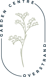
It’s our pleasure to share with you a new chapter of Garden Centre Overstrand, and what better way to start, than with a sophisticated new logo and a fresh reskin of our website!
We were looking for something expressive, free flowing and something that represented our gorgeous location without being too cliche. Let us introduce you to Jess Henry, the local illustrator who created the initial design concept and blueprint for our new logo. Jess said, ‘My own work is often built around delicate floral patterns and inspired by my own love for plants using prints, inks and sometimes watercolour. Working on the new branding for Garden Centre Overstand was such a pleasure to work on, and right up my street!”
“We wanted something to represent Overstrand, a gorgeously wild and typically Norfolk stretch of beach. So, we decided to use sea lavender as the main focus, which is a fairly dominant plant species typical of Norfolk saltmarshes. The thin stems and small flowers worked really well when drawn in my minimalist and sketchy style of drawing and lent itself to a vintage, botanical style.”
“I’m very proud to have worked alongside Victoria and her team at GCO to create something really special for them. Seeing my design out there is really exciting too and I really look forward to seeing where else it will be used.’
Here are some of Jess’s original sketches:


A small video of Jess’s live drawing.
A bit about sea lavender
Sometimes referred to as a statice flower, extra points if you know it by its Latin name Limonium Sinuatum. Sea lavender may look delicate, but it is a hardy plant that can survive in fairly harsh conditions, i.e. in places where the soil is very salty! The petals are often purple or white and smell distinctive, but not how you might expect. Sea lavender is in no way related to the common, heady smelling lavender that we have growing in abundance in our gardens. It actually belongs to the Plumbagincacea family, more commonly known as the Leadwort or Plumbago family. You might be surprised to learn that the smelly lavender we use in essential oils, soaps and potpourri, is part of the mint family.
Sea lavender grows all over the world, and is native to the Mediterranean, Southern Europe, and parts of Asia and Africa. It has been widely cultivated in Europe over the centuries, mainly due to its medicinal properties. Nowadays, it’s used mainly as a pretty addition to dried flower arrangements and considered ‘ornamental’. When dired properly, statice or sea lavender can retain its colour for years.
The symbolism of sea lavender, for someone very special
In terms of its symbolism, it’s said that the Victorians considered giving sea lavender as a gift that meant ‘miss you’. Their flower language is also supposed to signify ‘remembrance’, which is perhaps a nod towards its tendencies to last a long time when dried!
This sentiment of ‘remembrance’ is really important to us here at Garden Centre Overstrand. If you don’t know the story of how we came to be, the business was bought ‘with a handshake’ by a gentleman named Liam and was passed over to his daughter, Victoria, to run. Together they grew the plants and grew the business until sadly in 2019 Liam passed away. For us, the sea lavender in our logo symbolises so much more than just a brand revamp. It’s a symbol of a journey shared by father and daughter, a symbol of remembrance, and marks a new chapter to reignite a passion and pave the way to a new direction. It all feels very special to us, and especially to our director, Victoria.
A journey from paper to digital
With Jess’s mark, at the forefront of the concept, the design was developed by local digital designer, Jordan Syer. He took inspiration from minimal typography, the beauty and balance of garden design and he used different gardening shapes and frames to help encapsulate the beauty of nature.
Jordan tells us, “due to the length of the brand name, we needed to create a mark that felt organic, simple and clean but most of all balanced. This is why we positioned the typography off centre within the primary mark and connected using the lines in order to help connect and shape the typography. In addition, the use of the shape helped to connect the logo and frame the mark that Jess had created but also linked back to our inspiration of garden shapes and frames.”

Our New logo designed by Nu Image
“In terms of colour, we stripped it right back and used a simple background colour palette. We then worked with colour combinations and earthy tones that worked well in harmony and that linked the imagery to nature. It was exciting to work with Garden Centre Overstrand and see this design through, from the ground up!”
It was only natural that the illustrations, colour palette and overall aesthetic behind the logo informed the new website design. We hope you enjoy it just as much as we do!
A little thank you
We would like to thank Jess, Jordan and the Team at Nu Image for giving us a fresh new look. We are eager to grow our new brand and make our mark locally as a unique and specialist plant store by the sea.
Be sure to pay us a visit at Garden Centre Overstrand soon!


